 Here is a longer term point and figure chart of the Spiders. Earlier this morning I posted a couple of shorter term charts on this market.
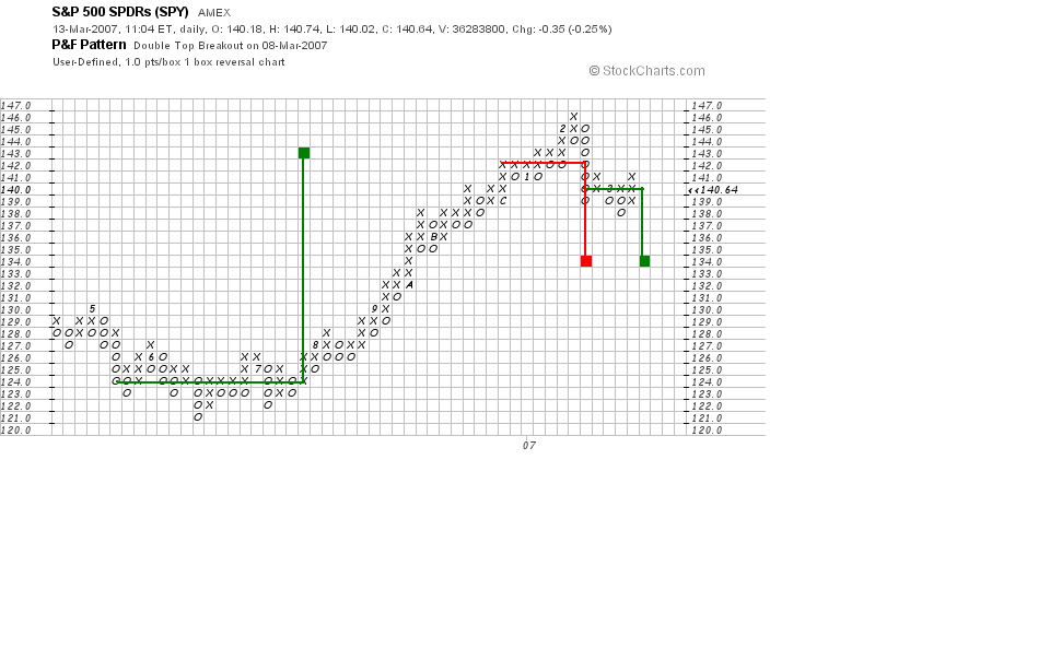
 The chart above is a 1 box reversal chart with box size equal to 1 Spider point. The chart comes to us courtesty of StockCharts.com which has the best browser based point and figure charting package that I have come across. Sadly, the data used by StockCharts.com is adjusted for dividend payouts and this distorts longer term charts like this one. Longer term trendlines are consequently less reliable as are longer term point and figure counts. However, if one is aware of these problems then one can work around them.
On the chart above I have illustrated the counting method for 1 box reversal charts. The first significant period of sideways action (which the point and figure community calls a "congestion area") developed during the June - August 2006 period around the low points of the May-June 2006 break. Once the market broke out on the upside from this congestion area one could count across the 124 price line and find that the congestion area was 17 squares wide at this point. This projects an upside price target 17 points higher, but remember that this chart is distorted by dividend payouts. On a real time print basis the 124 price line would actually be at 126 and so we should add 17 points to 126 to get an upside target of 143.
This chart gives some information about the likely downside target for the current break from the February 22 top. I have illustrated two downside counts, the first one in red and the second in green. The second one is based on the hypothesis that the market will turn downward from its current levels. Both counts project a low at 134. But I think this is a reaction in a bull market so it would be normal for the market to stop shy of its ideal counting target. My own 135 downside target reflects this consideration.
No comments:
Post a Comment